Quinnected Media Co. – Brand Identity & Logo Design
Quinnected Media Co. – Brand Identity & Logo Design
Quinnected Media Co. – Brand Identity & Logo Design
Full Brand Development | Logo Design | Visual Identity System
Project Summary
As the founder and lead creative of Quinnected Media Co., I took on the challenge of crafting a brand identity that represents more than just visuals—it needed to capture purpose, growth, and connection. The result? A powerful and scalable brand system built for a digital-first company.
🔻 Brand Vision
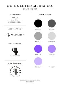
Target. Align. Accelerate.
This phrase became the guiding principle behind every visual and strategic decision. The brand had to feel intentional, modern, and ready for scale.
What I Delivered
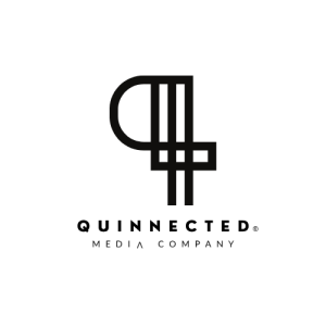
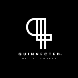
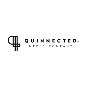
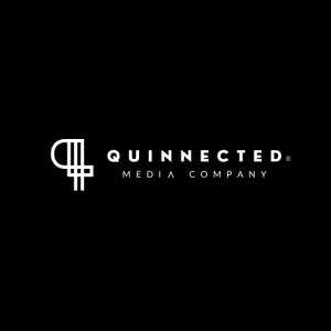
Logo Design
I created three professional logo variations:
-
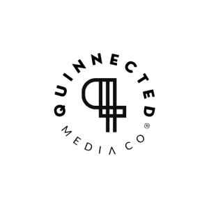
A bold “Q” monogram to symbolize structure and connectivity
-
Horizontal, stacked, and circular lockups for flexible application
-
Balanced use of geometric lines and clean spacing for scalability

Color Palette
A dual-tone system of deep neutrals and electric purples was chosen to reflect both professionalism and creative energy.
-
#000000 | Black
-
#894EFF, #B089FD | Accent Purples
-
#FFFFFF | White
-
-
Soft grays for support and balance
-
✅ Typography
A mix of modern sans-serifs for clarity and bold headers for authority:
-
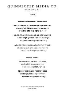
Headlines: Montserrat Extra-Bold & Oswald
-
Body Copy: Didact Gothic & Montserrat
Strategic Outcome
This branding system supports Quinnected’s mission of helping businesses grow through digital marketing. Every asset—logos, colors, fonts—was built for consistency across platforms: from websites and presentations to social media and podcast assets.
Tools Used
-
Canva Pro
-
Adobe Illustrator
-
Figma (for brand board layouts)
Services Included
-
Brand Strategy
-
Logo Design
-
Branding Kit Development
-
Social Media Asset Design
-
Typography + Color System Setup
Ready to Build a Brand That Resonates?
I specialize in branding systems that do more than look good—they work.
👉 Let’s connect and build your identity together.
Clients:
Category:
Date:
-
Previous project
PROJECT TITLE -
next project
PROJECT TITLE